
Nice unis: Do clothes make a team? Plus, Five Best Logos/Five Best Uniforms
Fashion is not a topic usually associated with sports, but teams with cool, or at least not embarrassing, uniforms tend toward more success. When we think of Penn State football, who can not think of the cleverly simple blue and white uniforms? Or Yankee pinstripes? The Dallas Cowboy star? The Silver and Black?
The uniforms and logos are as much a part of the teams as the players who wear (wore) them. (Believe it or not there is an organization called the Society for Sports Uniform Research, aka SSUR, which has a good site with links to the history of logos and uniforms, including the blog Uni Watch: The Obsessive Study of Athletics Aesthetics.)
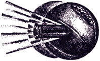
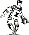
Is it any wonder that the Broncos, Buccaneers and Patriots started winning Super Bowls after their jerseys, pants and helmets started looking manly? (Note to the Cleveland Indians: get a new logo.) There are exceptions: the Arizona Diamondbacks, World Series winners in 2001, have ugly unis, the irreverent--but ghastly--Oakland As get-up has been worn by champs, and the rather cool Arizona Cardinals logo has never helped its team, but overall the traditional powerhouses: the Yankees, the Bears, and Michigan football have cool duds and nice design. The fashion world is a fickle one so the most iconic uni-logo combinations are usually more traditional and sturdy--the equivalent of the blue suit. But smart design plays a role: look at the Packers 'G' which just says working-class Wisconsin. Perhaps we are in the midst of football season so the NBA has not caught my attention yet, but basketball uniforms and logos seem rather hopeless: the Baltimore Bullets, circa 1949-1955, above left, showing a bullet going through a ball is a head-scratcher; and, above right, an old Pistons logo featuring a stiff, slow, goofy tinman with, presumably, no heart who appears to be tripping over his own metal foot. And yet it bothers me that the NBA powers-that-be keep "updating" logos year-by-year. There is a lack of continuity, nary a nod to the past.
Six best logos: Yankees, Red Sox, Chicago Bears, Michigan football (helmet and 'M'), Cincinatti Reds, Detroit Red Wings. (Honorable Mention: Florida Gators, Boston Celtics.)
Six best uniforms: Oakland Raiders, Yankees, Manchester United, USC football, San Diego Chargers (powder blue), Penn State/Alabama/Cleveland Browns football (tie). (Honorable Mention: Pittsburgh Steelers, Los Angeles Dodgers, Brazilian national soccer team.)
posted by gap at 1:29 PM
![]()
![]()


3 Comments:
Two logos I've always liked are the Philadelphia Flyers and the Oakland A's. That flying P looks sooooo 1960s, but at the same time it's kind of timeless. And I like the fact that the A's have kept that gothic font "A" for, like, a hundred years, from Philadelphia to Kansas City to Oakland.
This comment has been removed by the author.
Interesting article indeed! Personnally, I think it can actually have an impact on the audience. I support the Chicago Bears and I love the logo. That's definitely one of the reason why I'm buying their jerseys and apparel. I found really cool hats here: http://store.chicagotribune.com/sports/nfl/bears/accessories.html
Thanks for this article!
Post a Comment
<< Home